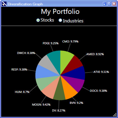
The Diversification Graph is a pie chart that shows the allocation of portfolio resources by stock, or by industry on a percentage basis. The Diversification Graph can also be found in the Portfolio Summary Report.
Viewing the Diversification Graph:
Select a portfolio. The selected portfolio will be highlighted on the left side.
Click the "Reports" Button on the Local Toolbar.
Select "View Diversification Graph".
Click the radio button next to Stocks or Industries.